Colour is one of the most powerful tools in interior design and one of the most important to get right. It has the ability to influence mood, define spaces, and create a home that truly reflects your personality. Choosing the right colours can be both exciting and overwhelming, especially with so many shades, finishes, and brands to choose from. At Anna Wakeham Interiors, we specialise in helping clients navigate this journey, ensuring their homes feel cohesive, stylish, and personal.
In this guide, we explore how to use colour effectively in your home, discuss the best paint brands to consider, and explain why working with a professional colour consultant can make all the difference.
Why is choosing the right interior paint colour important for home design?
Any colour that your choose will set the ‘tone’ of your home. A room painted black might appeal to some but would feel dark. It may, however, be an option for a cinema room, for instance, where dark walls would be an important element of an overall scheme. Brilliant white could feel cold and interesting. There are, of course, plenty of colours in between these two shades, giving homeowners plenty of choice.
Understanding the Psychology of Colour
Before choosing a colour scheme, it’s essential to consider the emotional impact different shades can have. Colours can energise, soothe, or add sophistication depending on the tones used and their placement.
Warm Colours (reds, oranges, yellows) create a cosy, inviting atmosphere, perfect for living rooms or dining areas where social interaction is encouraged.
Cool Colours (blues, greens, purples) promote calmness and relaxation, making them ideal for bedrooms and bathrooms.
Neutral Colours (whites, greys, beiges) act as a versatile foundation that can be layered with textures and accessories to add depth and personality.
Best Paint Colours for Different Rooms
Each room in your home serves a different purpose, so selecting the right colour is key to enhancing its functionality and atmosphere.
Kitchen
The kitchen is often the heart of the home, and colour plays a key role in making it feel both stylish and practical.
Soft Greys & Off-Whites – Shades like Farrow & Ball’s Cornforth White or Little Greene’s French Grey create a timeless, elegant backdrop.
Deep Blues & Greens – For a more dramatic statement particularly on kitchen cabinets, Farrow & Ball’s Hague Blue or Benjamin Moore’s Hunter Green add depth and contrast beautifully with brass or wooden finishes.
Warm Neutrals and Reds – For something unusual and in a cosy space, consider a colour like Edward Bulmer’s Red Ochre on the kitchen units. Absolutely stunning!
Bathroom
Many wish their bathrooms to feel fresh and spa-like, and the right colour can enhance this serene atmosphere.
Soft Blues & Greens – Little Greene’s Aquamarine and Farrow & Ball’s Skylight evoke a tranquil, airy feel (note these are well placed in a South facing room)
Earthy Neutrals – we love Farrow and Ball’s Shaded White and Drop Cloth and are often our go-to
Dramatic Charcoals – For a boutique-hotel feel, deep tones like Graphite by Paint & Paper Library add contrast while making white fixtures pop.
Hallways
Hallways and landings are often under rated in their ability to provide a cohesive feel to the home. We always consider the downstairs hallway to be a room as it’s the first part of the house a visitor will see when they walk through the front door.
Depending on the style and look of the property, colours to consider might be:
Soft Greys & Greiges – Farrow & Ball’s Ammonite or Little Greene’s Slaked Lime provide a perfect neutral backdrop for the contemporary home.
Rich Earthy Tones – Farrow and Ball’s Cord is an unusual choice but adds warmth and depth, complementing wooden flooring or panelling beautifully. This can work well in a traditional property with uses of red.
Two-Tone Walls – If you have a picture rail or dado rail in your hallway, combining a lighter shade on top with a darker hue below (such as Farrow & Ball’s Railings on skirting and School House White on walls) creates an elegant contrast. Particularly good in a terraced house where the hallways are quite a significant part of the home.
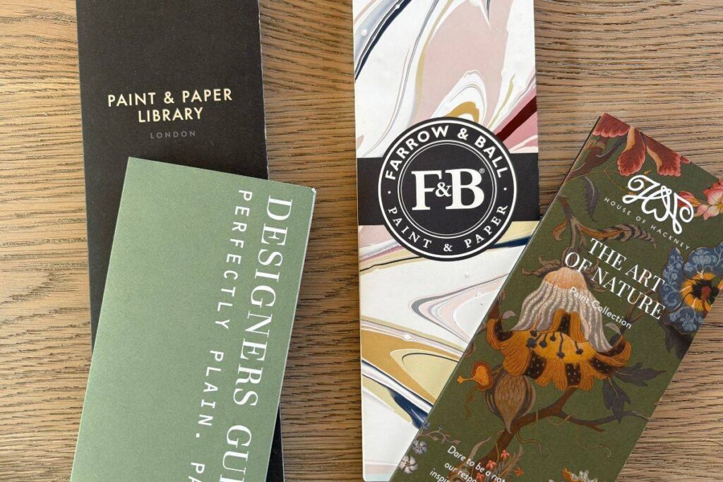
Choosing the Best Paint Brands
Not all paints are created equal. At Anna Wakeham Interiors, we work with premium brands that offer superior coverage, durability, and an exquisite depth of colour. Our go to recommendations are:
Farrow & Ball
Renowned for their rich pigments and eco-friendly formulas, Farrow & Ball’s paints create stunning depth and react beautifully to natural light. Their Estate Emulsion provides a signature chalky finish, while the Modern Emulsion offers extra durability. If you like the concept of colour drenching (painting everything all one colour often including ceilings) try their new Dead Flat range – the paint that works on every surface. It’s great and works out more cost-effectively.
Little Greene
A heritage brand that blends historical colour palettes with contemporary trends. Their Intelligent Matt Emulsion is perfect for high-traffic areas, offering a washable, low-sheen finish.
Dulux Heritage Range
A more cost-effective option and a product we use in holiday lets or Airbnb’s is Dulux’s Heritage Collection, as it is an excellent choice for those seeking classic shades with modern, high-performance finishes.
Benjamin Moore
A favourite among interior designers, Benjamin Moore’s Aura Range boasts incredible durability and a vast colour selection. Their shades, like Revere Pewter, are known for their timeless appeal.
Edward Bulmer Natural Paint
Looking for eco-friendly paint? An absolute favourite for us, Edward Bulmer’s plant-based, chemical-free paints provide an excellent sustainable alternative without compromising on colour quality. Take a look at their Invisible Green – unmatchable!
Mixing your own paint colours
Because of budget concerns, many clients often ask about colour matching paints by having the colours mixed themselves. This is a service Dulux offer. This is not something we would recommend as from past experience the colours and finishes are often unexpected and results are rarely the same.
Should I follow colour trends or stick to timeless shades?
Choose colours that you love and enjoy living with – this probably won’t be what’s on trend. Blues and greens are a good place to start, but yellow and red can add character and ensure your home is cosy and warm. Many homeowners chose neutrals because they are timeless but don’t give the warmth and character a carefully selected colour may.
What’s the best way to test paint colours before committing?
If possible buy some sample pots and test them up to to three places in a room – in the middle of a wall, by a window and by the door. This will give you a good idea if the colour is going to be something you will like.
How do paint finishes (matt, satin, gloss) affect the final look?
Our general rule is to go matt all the way and to avoid any form of reflection or shine in the paintwork. That being said, rules are there to break and in the right place a gloss ceiling or woodwork can work really well!
Why Work with a Colour Consultant?
While choosing paint colours might seem straightforward, it requires expertise to ensure the final result matches your vision. There are many versions of white and for an untrained eye this can be overwhelming. Working with Anna Wakeham Interiors ensures:
Expert Knowledge – We understand how lighting, room size, and existing furnishings affect colour perception. Your small north-facing spare room will need to be treated differently to your south-facing bathroom.
Customised Palettes – We create bespoke colour schemes that enhance your home’s architecture and interior style
Time & Cost Efficiency – Avoid costly mistakes by selecting the right colours and finishes the first time.
Using colour in your home with Anna Wakeham Interiors
At Anna Wakeham Interiors, we believe colour should tell a story—your story. We keep an eye on trends but don’t follow them, and we co-ordinate our palettes with what will work in your space whether that be a country cottage or a city centre penthouse. We consider all options with you including location, direction of the house, styling, colours for lighter/darker spaces, and suggest paint colours accordingly.
The Colour Consultation process
Initial Consultation 30 minutes FREE – We discuss your style, preferences, and lifestyle needs.
On-Site Colour Assessment – We evaluate natural and artificial lighting conditions, room sizes and spaces. We discuss various colour options with you, artworks, overall look and feel, visual interest and your usage of rooms before making recommendations.
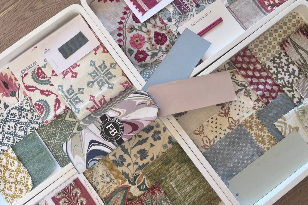
Samples and colour Palette – based on our discussions, we provide mood boards, colour swatches and paint samples for your home.
Colour is one of the most important – and enjoyable – areas of interior design but also one of the hardest to get right. Many say they wouldn’t consider a bold colour choice, but in a dark space it can make a room feel warm and cosy. Considering what type of property you live in to what time of day you will use your spaces, will all be crucial to deciding what colour to paint your home.
Book a Colour Consultation with Anna Wakeham Interiors today and we can help you create a cohesive look throughout your house.